How to Edit Dial-in Registration Page
Last updated: March 12, 2025
You can access the Dial-in page editing tools from the left sidebar under Live → Teleconference settings.
Under Dial-in Registration Settings, you will find a button called Edit Dial-in Page, which opens the page editor.
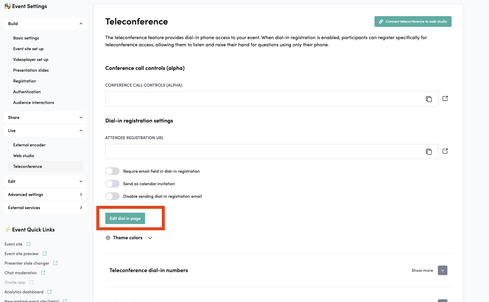
Dial-in Registration Settings
These settings allow you to control how users register via the Dial-in page:
-
Require email field in dial-in registration
Requires every user registering through the Dial-in page to provide an email address.
-
Send as calendar invitation
Sends a calendar invitation to the user if they provided an email address.
-
Disable sending dial-in registration email
Prevents the system from sending the automatic registration email.
In this section, you also have access to the theme color settings for customizing the Dial-in page appearance.
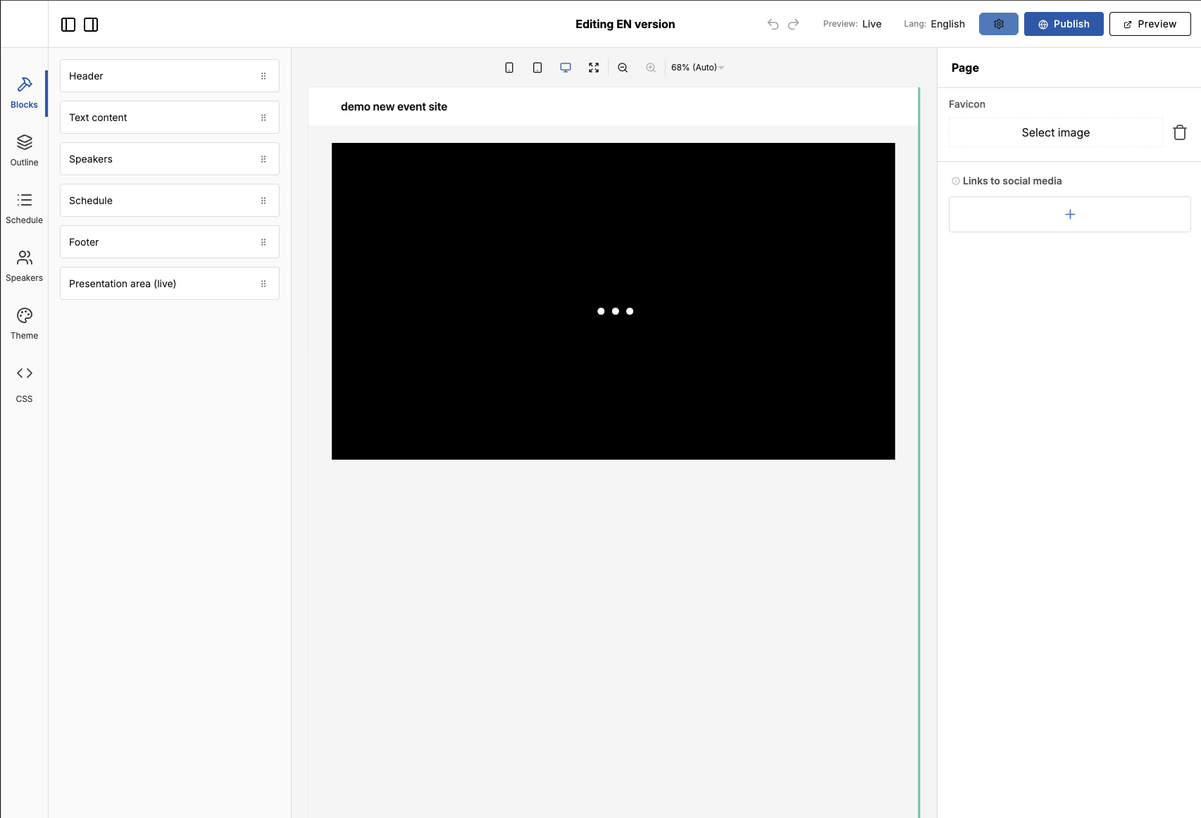
Editing the Dial-in Page
You can access the page editor by clicking “Edit Dial-in Page.”
Text Input: Dial-in texts
In the modal instructions, you can edit the keywords {eventTitle}, {conferenceId}, and {userId}. These placeholders are replaced with the corresponding values per event.
Remember to add # after {userId} and {conferenceId}.
In the editor, you’ll find the available page components on the left side, and the settings for the selected component on the right. The editor’s left-side navigation includes:
- Blocks — the components you can add to the page. See the block guide for every block and its settings.
- Outline — the components currently placed on the page.
- Schedule — the event’s global schedule. See how to add and modify a schedule.
- Speakers — the event’s speakers. See how to add and modify speakers.
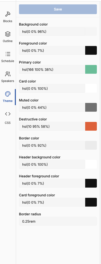
- Theme — the page’s theme colors. See theme colors.
The CSS editor can always be found under the page settings or from the bottom bar by clicking the drag icon. (You can open the page settings by clicking on the page.)
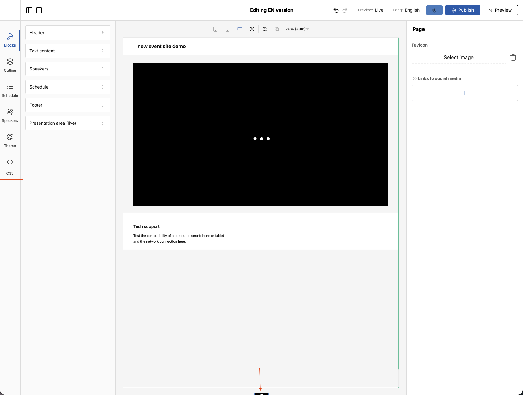
You can switch between different event stages from the Preview button. Next to it, you can see the language the page text defaults to — you can change the page language here if you’ve created pages in multiple languages. Publish saves the page.

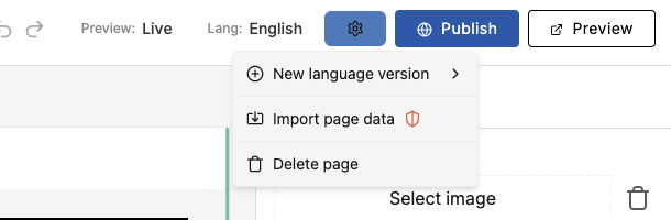
From the settings wheel, you can create new language versions, import page content from another event, or delete the pages for the selected language or all languages.
You add new components by dragging them from the left side into the page area in the center.
Clicking a component activates it and shows its settings on the right. See Building your event page — block guide for what each block does and the settings it offers.
How to add and modify a schedule
In the editor’s left-side navigation, click the Schedule button — it opens the schedule editor.
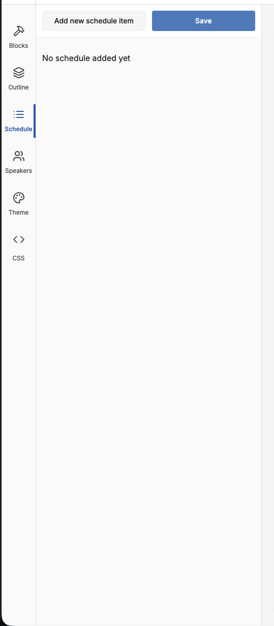
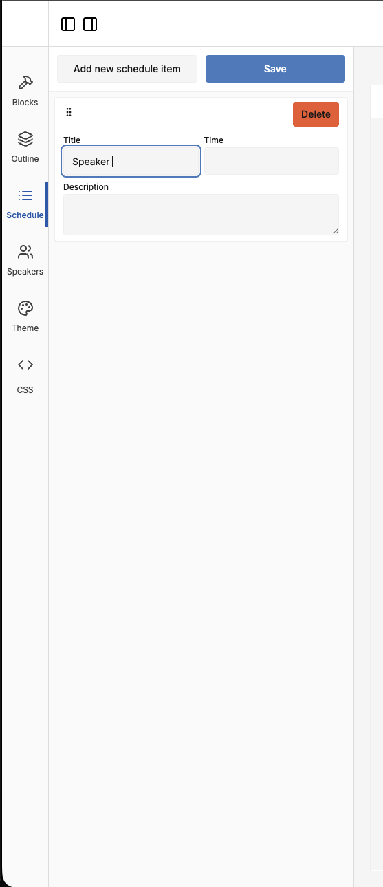
In the schedule editor you can add new items, rearrange them, modify them, and delete them. To add an item, click Add new schedule item.
Fill in the item’s details:
- Title
- Time
- Description
Add as many items as you need, then click Save to store your changes.
To make the schedule appear on the page, drag the Schedule element from the left side onto the page and click Publish.
How to add and modify speakers
In the editor’s left-side navigation, click Speakers.
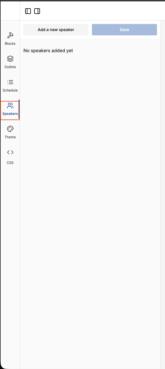
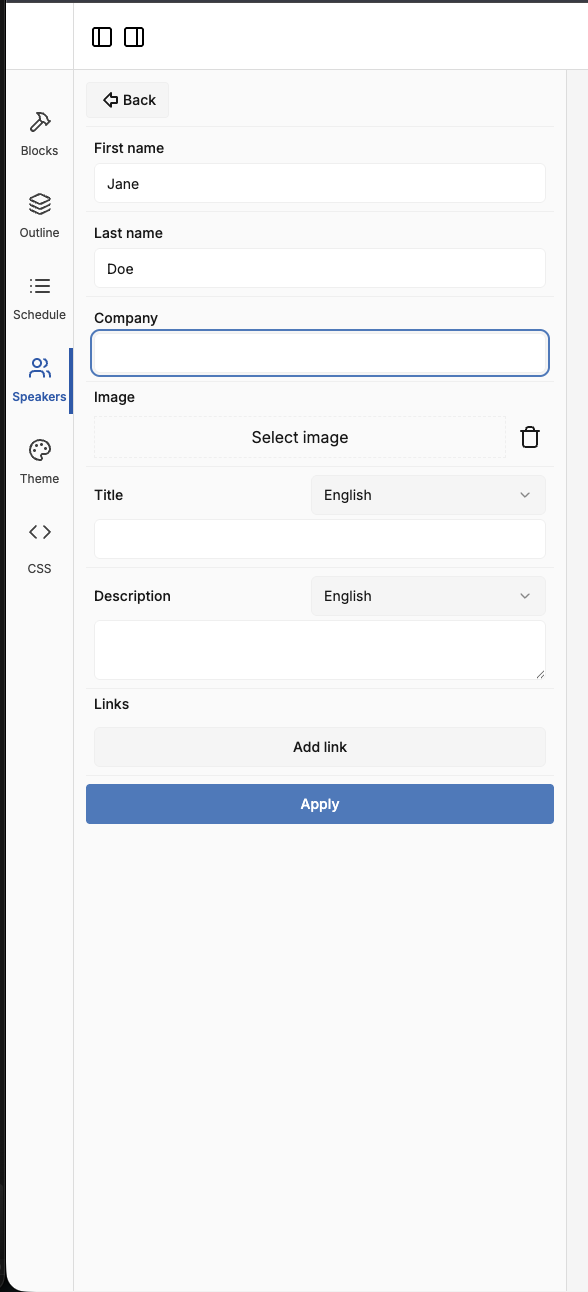
Click Add a new speaker. A new section opens where you can fill in the speaker’s information:
- First and last name
- Company
- Image
- Title (for each language your page supports)
- Description (for each language your page supports)
- Links
When you’re done, click Apply.
In the Speakers section you can also edit, rearrange, and delete existing speakers. To make speakers appear on the page, drag the Speaker element from the left side onto the page and click Publish.
Theme Colors
The site uses themes, which means that for each page you define the colors that its components will use.
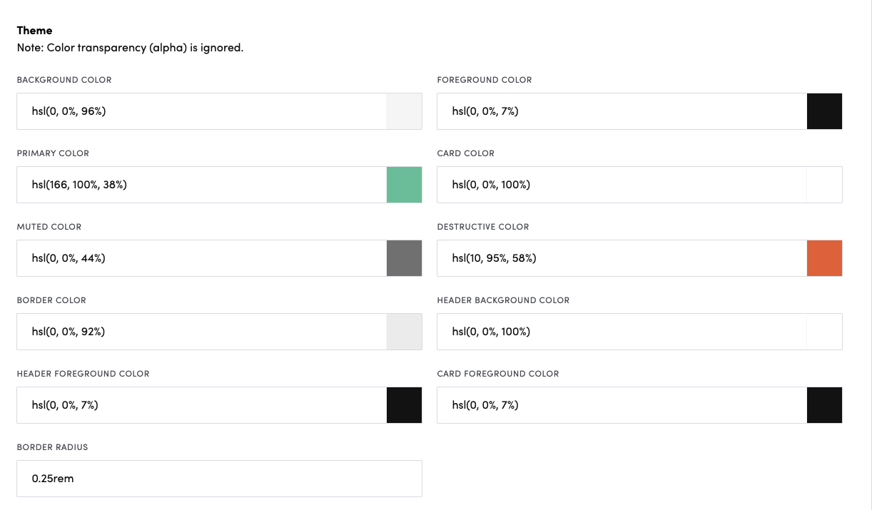
The descriptions below explain what each theme color controls. You can set them either in the admin (above) or from the Theme panel in the editor (right).
Background
- Purpose: Main page/app background color.
- Usage:
- Page backgrounds, input fields, button backgrounds
- Tooltip backgrounds (with
foregroundtext) - Audio player controls background
- Chat message backgrounds
Foreground
- Purpose: Primary text color throughout the site.
- Usage:
- Body text, headings, icons
- Button text on
backgroundbuttons - Form input text
- Navigation text
Card
- Purpose: Surface/container backgrounds elevated from
background. - Usage:
- Header, footer, chat area, registration forms, modals, popovers, dropdowns
- Speaker cards, schedule items, downloads panel, participation details
- Most UI component backgrounds (buttons, inputs when not transparent)
Card Foreground
- Purpose: Primary text color on
cardsurfaces (overridesforegroundon cards). - Usage:
- Text on cards: footer, chat messages, schedule items, speaker cards, countdown, dial-in panel
- Registration form labels, inputs, and choices
- Falls back to
foregroundwhen not set
Header Background
- Purpose: Background color for the site header bar (overrides
cardfor the header only). - Usage:
- Header / top navigation bar background
- Falls back to
cardwhen not set
Header Foreground
- Purpose: Text and icon color inside the header.
- Usage:
- Header navigation text and icons
- Language selector
- “Recognized” registrant bar, and sign-in / registration text shown in the header area
- Falls back to
foregroundwhen not set
Primary
- Purpose: Brand/accent color for interactive elements.
- Usage:
- Active/hover/focus states
- Links, selected items, chapter indicators, raised-hand status
- Search results highlighting
- Scrollbar thumbs
- Submit buttons (text on
foregroundbackground) - Active chat/transcript indicators
- Social media button hover borders
Muted
- Purpose: Subdued text and secondary information.
- Usage:
- Timestamps, placeholders, secondary labels, disabled states
- Inactive icon colors, audio visualizer bars
- Secondary button text
- Dropdown chevron icons
Destructive
- Purpose: Error, warning, or danger states.
- Usage: Delete buttons, error messages, tooltips
- Note: Use sparingly for critical actions.
Border
- Purpose: Borders for all UI elements.
- Usage:
- Component outlines, dividers, separators
- Focus states (in combination with
primaryfor active borders) - Cards, buttons, inputs, modals, dropdowns, sections
Border Radius
- Purpose: Defines the corner rounding for components.
Font settings
In the font settings, you can configure the fonts used throughout the page:
- Header Fonts: Choose the font for all headings (H1, H2, etc.).
- Fonts: Choose the font for all main text content.
The font dropdown lists standard browser fonts as well as Google Fonts.
On the Dial-in page, fonts aren’t set in the page editor — they’re managed in the Event Admin.
Teleconference Dial-in Numbers Settings
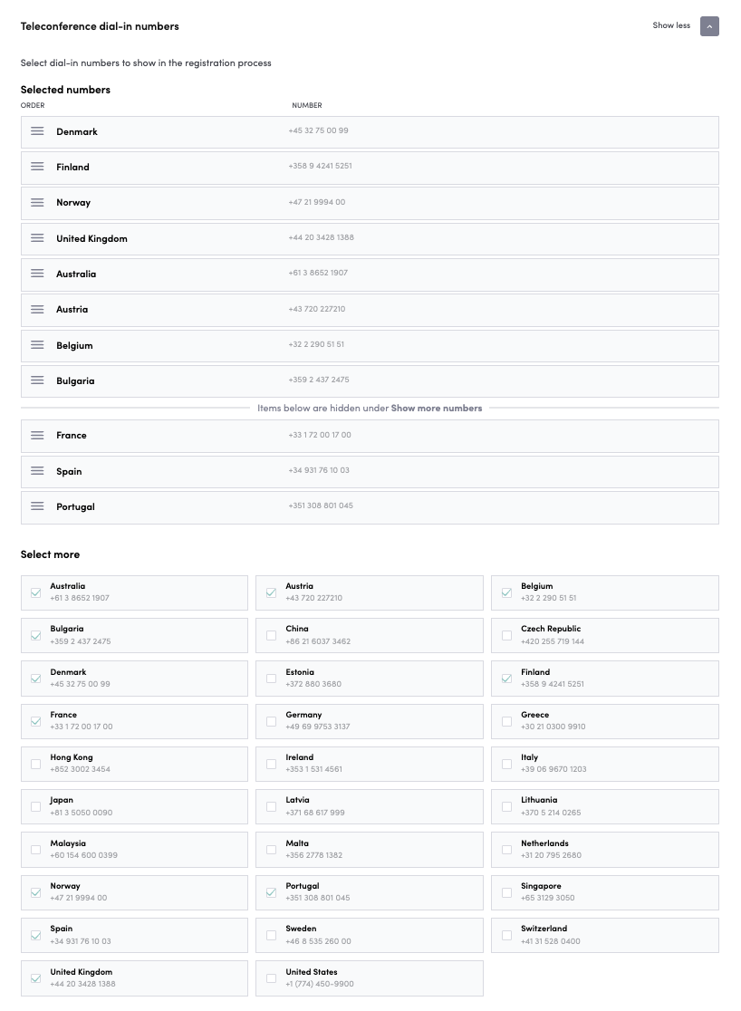
To configure dial-in numbers and registration settings for your conference call, go to Event Admin → Live → Teleconference settings.
In this setting, you can add, remove, or reorder the phone numbers displayed to the registered user for dialing into the teleconference. The first 8 numbers are shown directly to the user, and the rest appear under the Show more numbers button.